MACHINE LEARNING PROJECTS
E-COMMERCE DATA PREDICTION USING LINEAR REGRESSION MODEL IN PYTHON

This project is about an E-commerce company that that sells clothing online but they also have in-store style and clothing advice sessions. Customers sometimes order on a mobile app or website for the clothes they want. The company is trying to decide whether to focus their effort on their Mobile App experience or their website. In this project, I created an algorithm using Python which makes prediction to help them solve that problem.
LOAN PREDICTION USING DECISION TREE AND RANDOM FOREST

For this project we will be exploring publicly available data from LendingClub.com. Lending Club connects people who need money (borrowers) with people who have money (investors). Hopefully, as an investor you would want to invest in people who showed a profile of having a high probability of paying you back. We will try to create a model that will help predict this.
ANALYSIS ON EMERGENCY – 911 CALLS
.jpeg)
Like we all know that emergency is an unforeseen or sudden occurrence which demand immediate remedy or action. At some point, we tend to think more about why some emergency calls are been made and that’s the main reason I have decided to perform some analysis on the 911 calls dataset. For this project I will be analysing some 911 (emergency calls) data from Kaggle in Montgomert County Pennsylvania.
LUNG CANCER Prediction Using Logistic Regression MODEL IN PYTHON

In this project, I created an algorithm using logistic Regression model in python which makes prediction to enable people know their lung cancer risk status.
INTERACTIVE DASHBOARDS
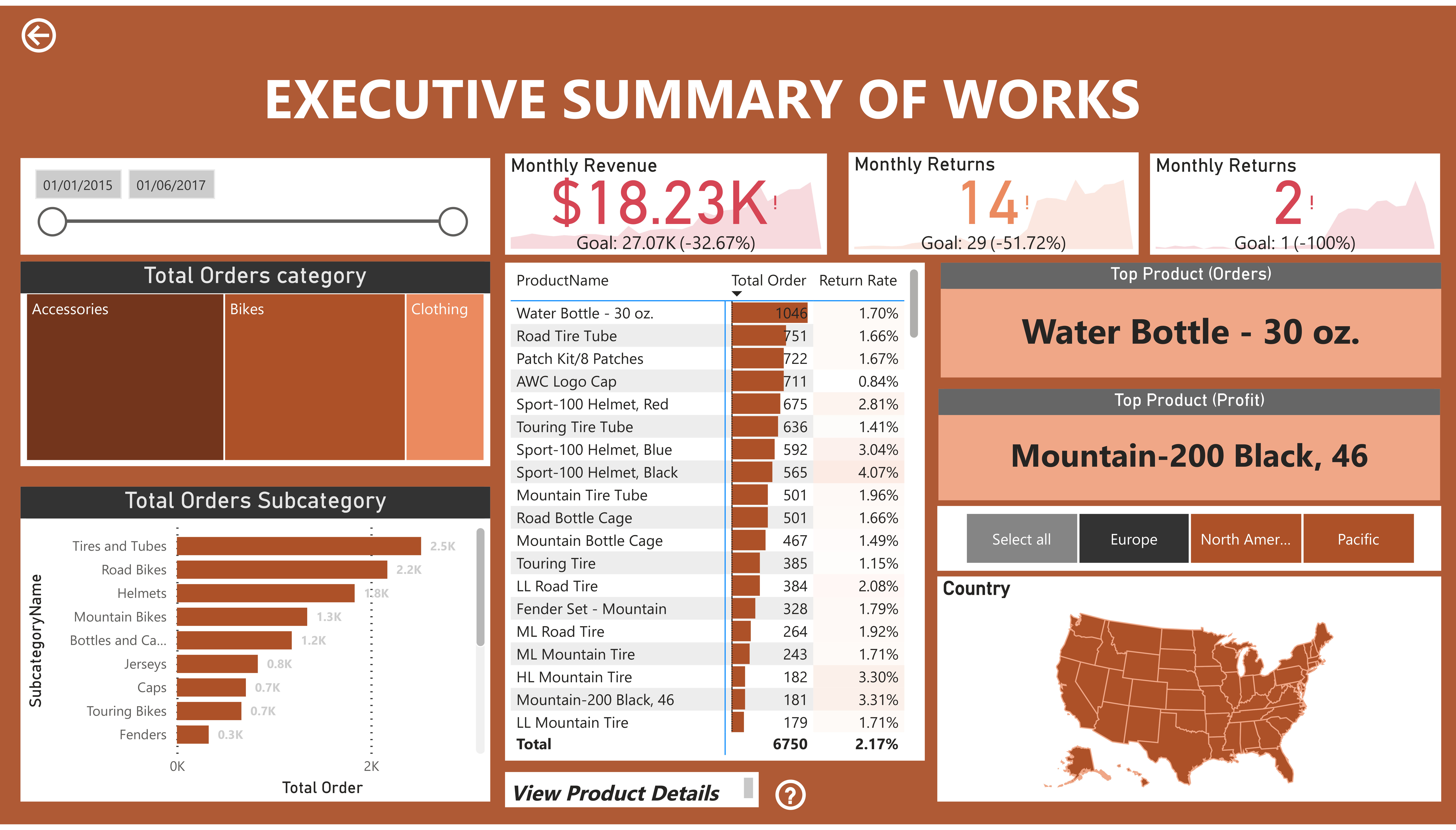
The dashboard presented paints a concerning a company's performance over a 26-month period. Both revenue and earnings fell short of targets, indicating a need for immediate corrective action. While the detailed breakdowns of product sales and return rates provide some insight, further interaction is crucial to identify the root causes of these shortcomings. Addressing these issues promptly is essential to ensure the company's financial stability and future success.
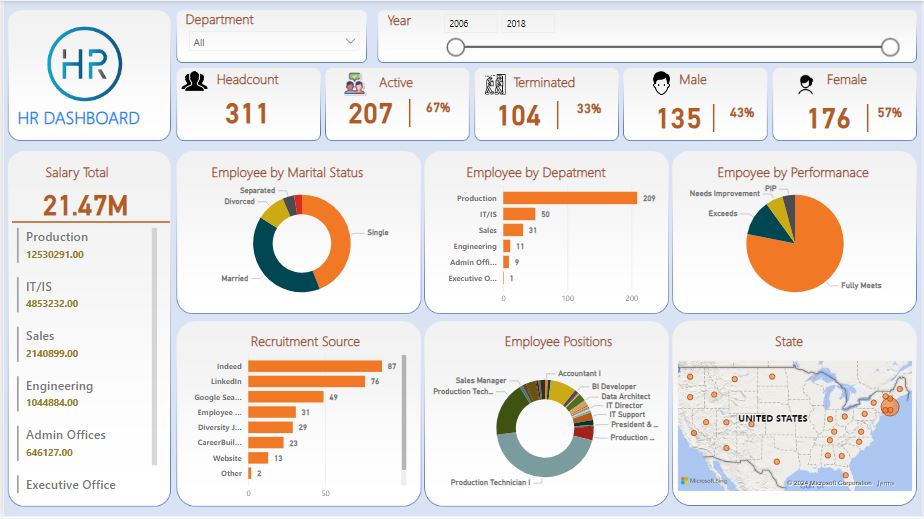
This dashboard offers a comprehensive overview of a company's employee information, most likely intended for the Human Resources department. It provides a snapshot of key metrics such as headcount, salary expenditure, demographics, and performance. With 67% of the workforce currently active, it's important to understand the reasons behind the remaining inactive employees. The breakdown of salary expenditure and employee demographics by gender and marital status offers valuable insights into workforce composition. Additionally, the performance rating distribution helps identify areas where employee development or recognition programs might be beneficial. This dashboard serves as a valuable tool for HR professionals to monitor workforce trends and make informed decisions.
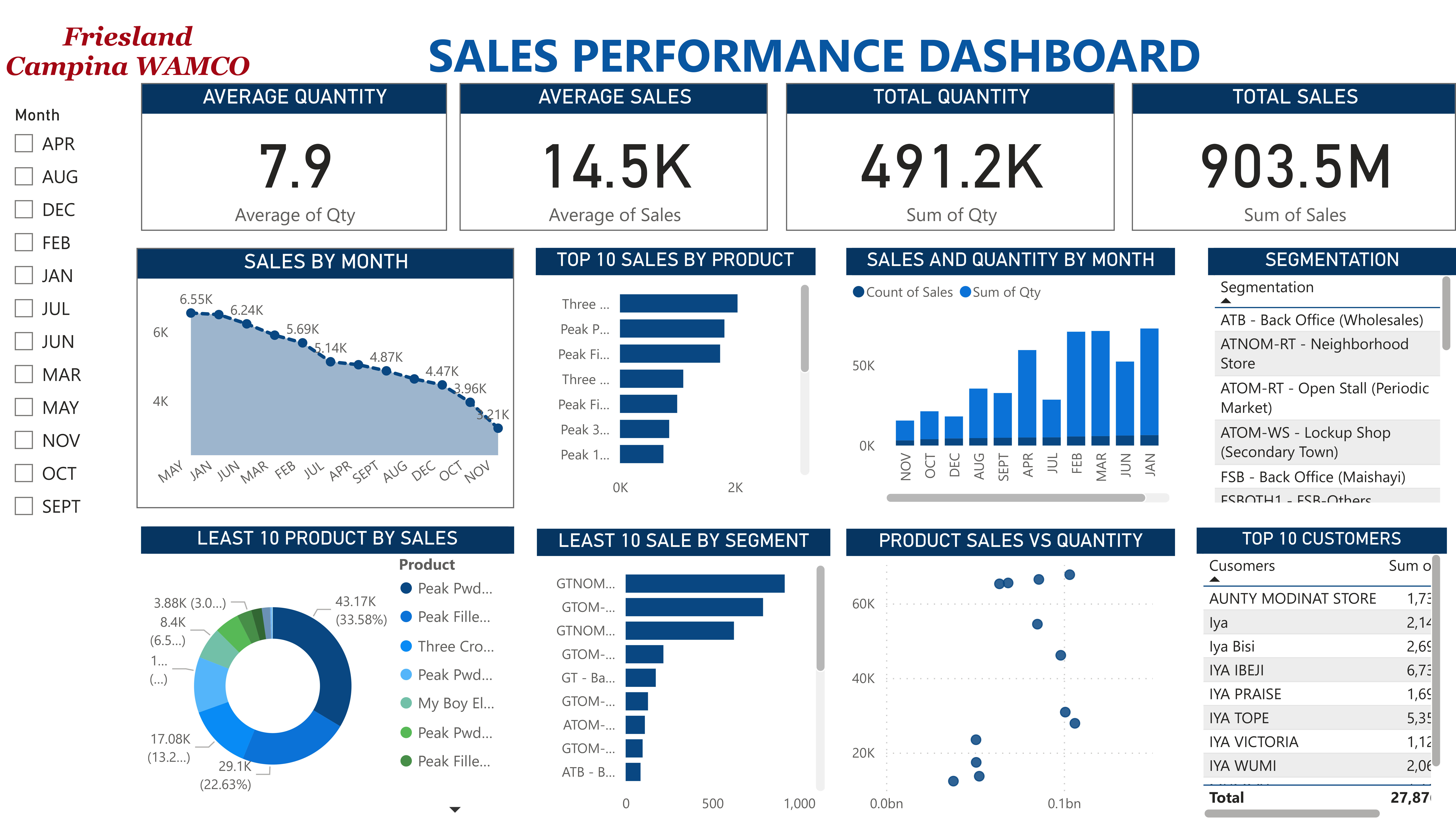
This Friesland Campina WAMCO sales dashboard offers a glimpse into their performance between April and November, revealing an average monthly sales of around 14,500 and a total of 903.5 million. "Peak" stands out as the top-selling product, followed by "Popic Fri" and "SOK". The sales graph suggests some fluctuation, with a peak in May and a dip in November. Additionally, "ATOM-RT Neighborhood" and "STORE" emerge as the leading customer segments. This data provides a starting point for understanding Friesland Campina WAMCO's sales, but further analysis may be required for a more comprehensive picture.
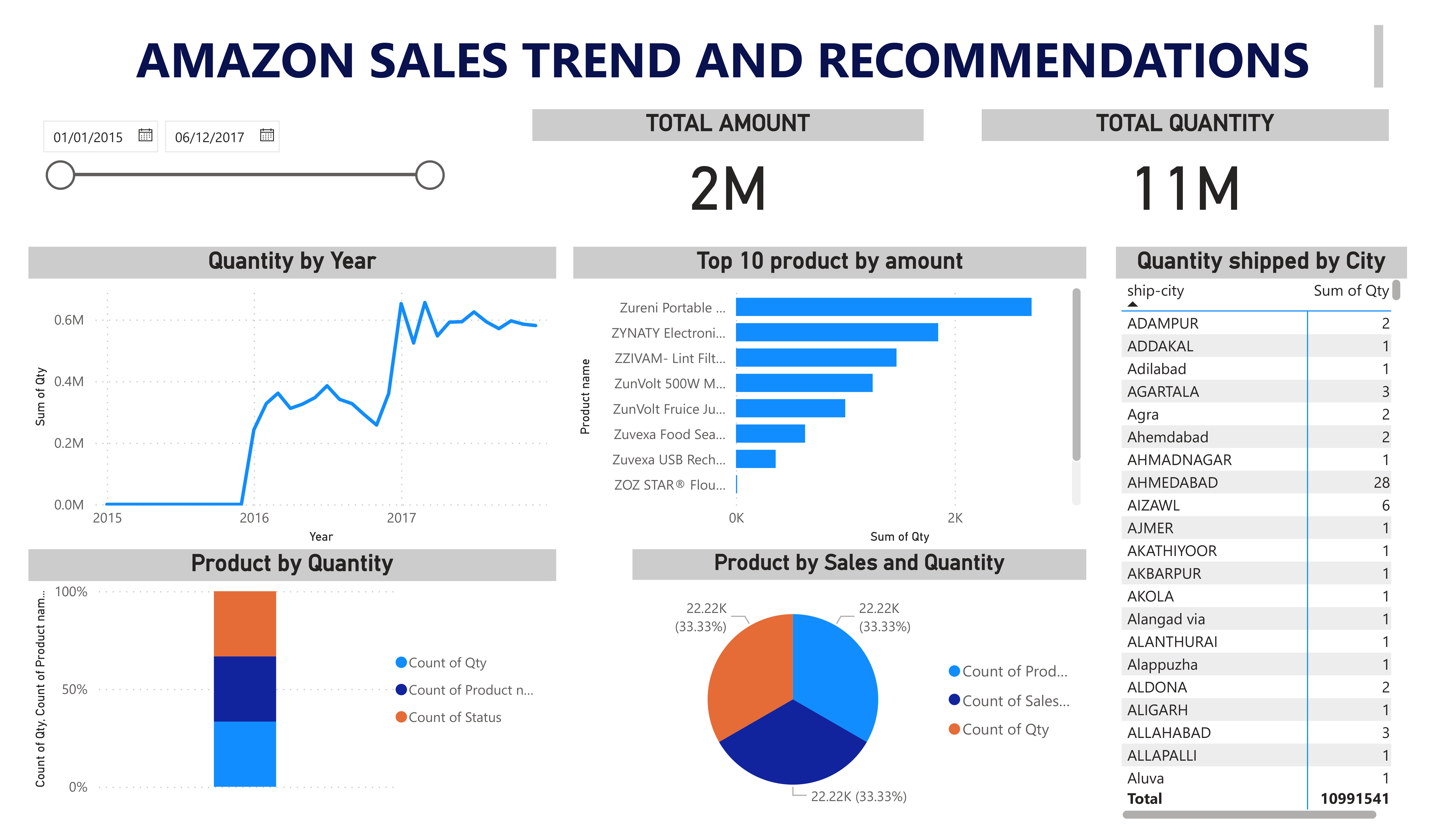
This dashboard sheds light on Amazon's sales performance, possibly over a three-year period. It reveals a positive trend, with both total sales amount and quantity increasing year-over-year. Additionally, the dashboard highlights the top-selling products, providing valuable insights into customer preferences. Furthermore, it pinpoints the cities with the highest shipment volume, potentially indicating areas with strong consumer demand. This data can be instrumental in informing strategic decisions about product selection, marketing efforts, and logistics optimization for Amazon.
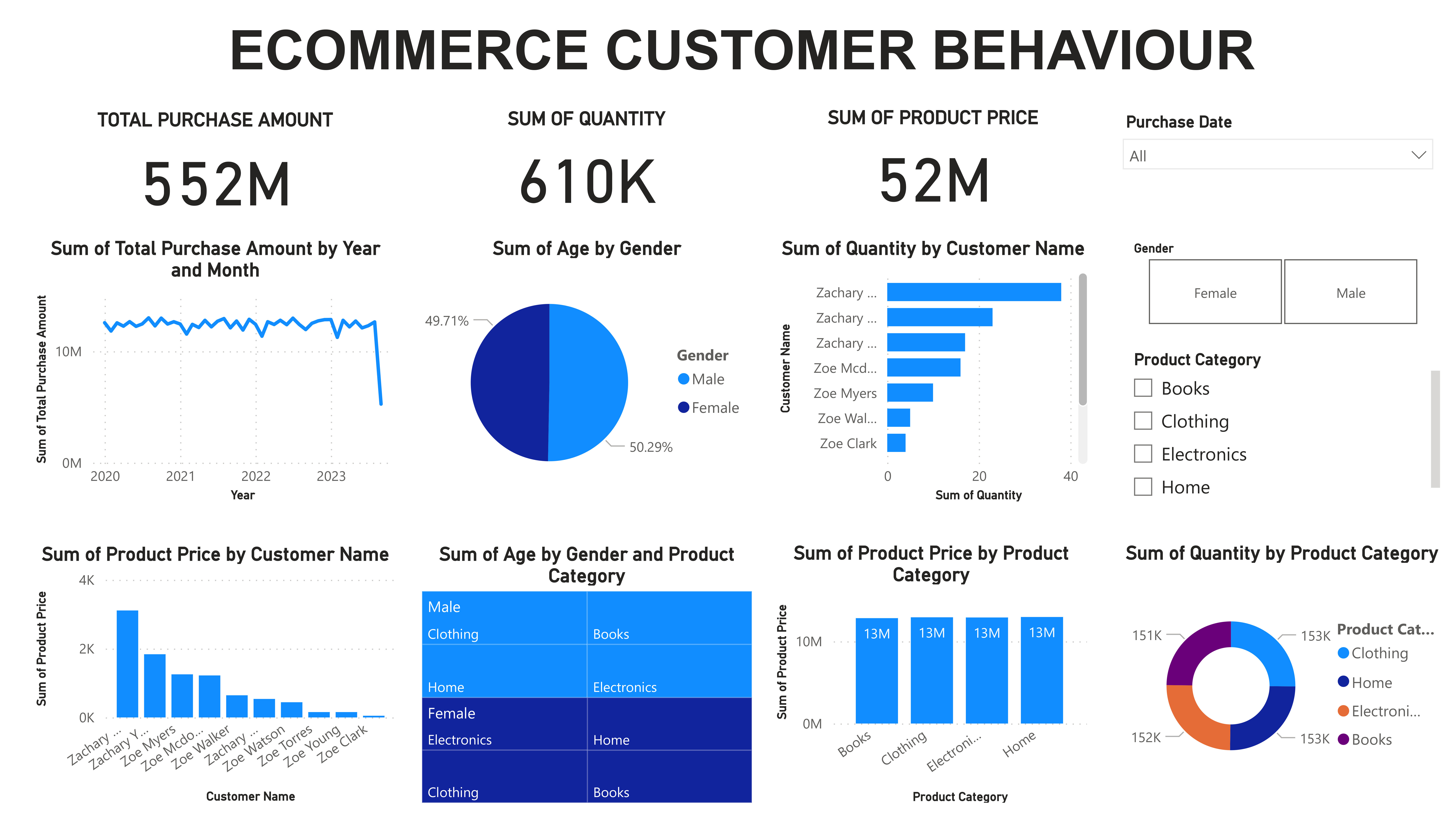
This e-commerce customer behavior dashboard dives into purchasing trends, revealing overall spending habits through metrics like total purchase amount and average product price. It also allows analysis of individual customer behavior by examining total quantity and purchase value per customer. Additionally, the dashboard sheds light on product performance by showcasing popular categories and price distribution, providing valuable insights to optimize product offerings and target specific customer segments.
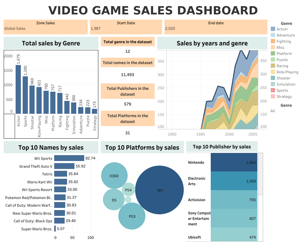
This comprehensive dashboard dives into the world of video game sales, slicing and dicing data across genres, platforms, publishers, and time. Action takes the center stage, captivating gamers with its thrills, followed closely by the competitive spirit of Sports, the intensity of Shooters, and the immersive worlds of RPGs. "Wii Sports" emerges as the undisputed champion, proving the timeless appeal of casual gaming. The battle for platform supremacy is fierce, with Nintendo, X360, and PS4 vying for dominance. When it comes to publishers, Electronic Arts reigns supreme, strategically outmaneuvering Nintendo and Activision.
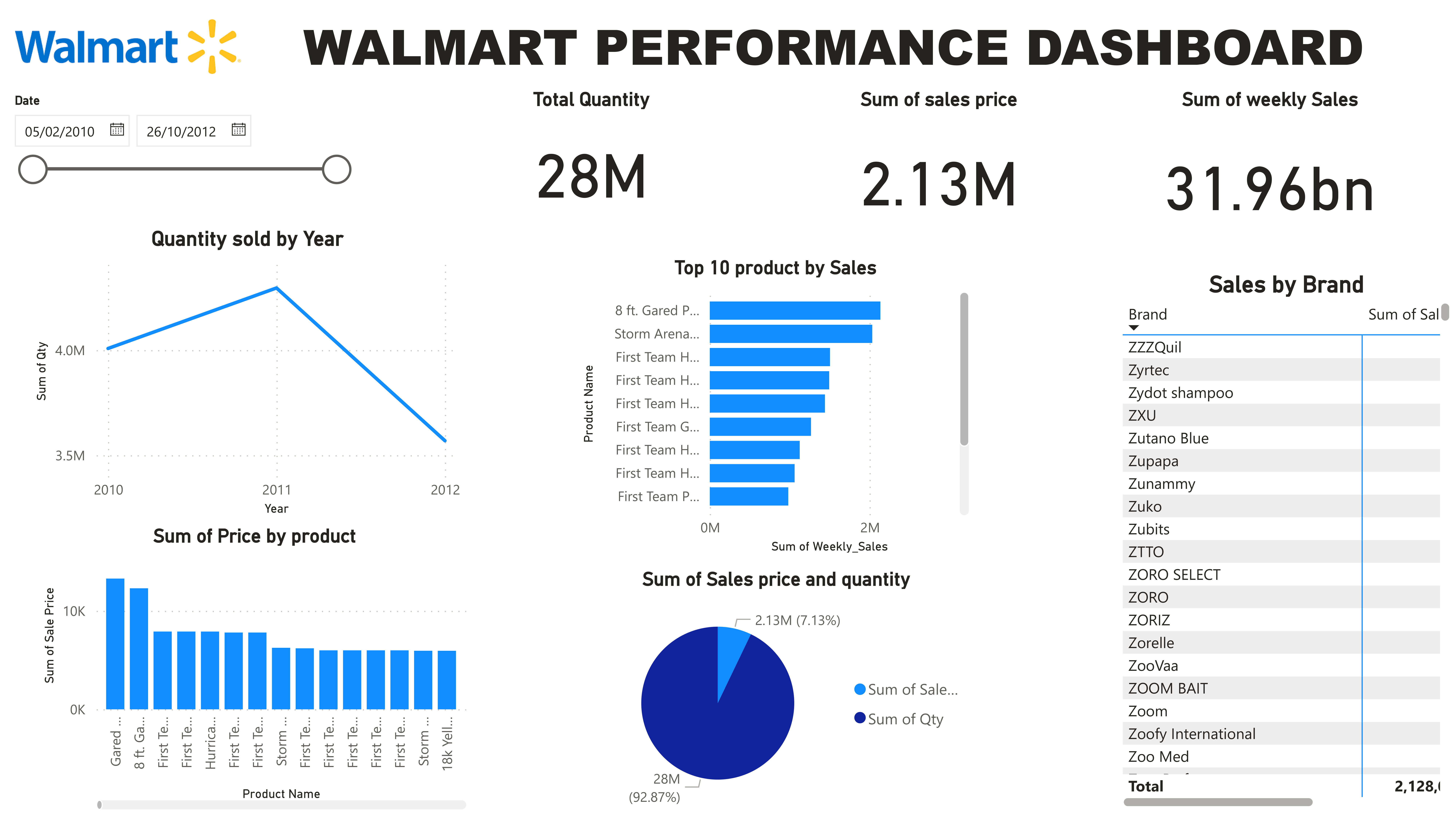
This custom-built dashboard sheds light on Walmart's sales performance, offering insights that might be specific to a particular department or product category. Key metrics include total sales volume, revenue generated, and sales trends over a weekly basis. Digging deeper, the dashboard reveals the top 10 best-selling products and their corresponding sales figures. While the broader context remains undisclosed, this information provides valuable guidance for Walmart to monitor departmental or categorical performance, identify sales leaders, and potentially implement targeted strategies to optimize product selection and promotions.
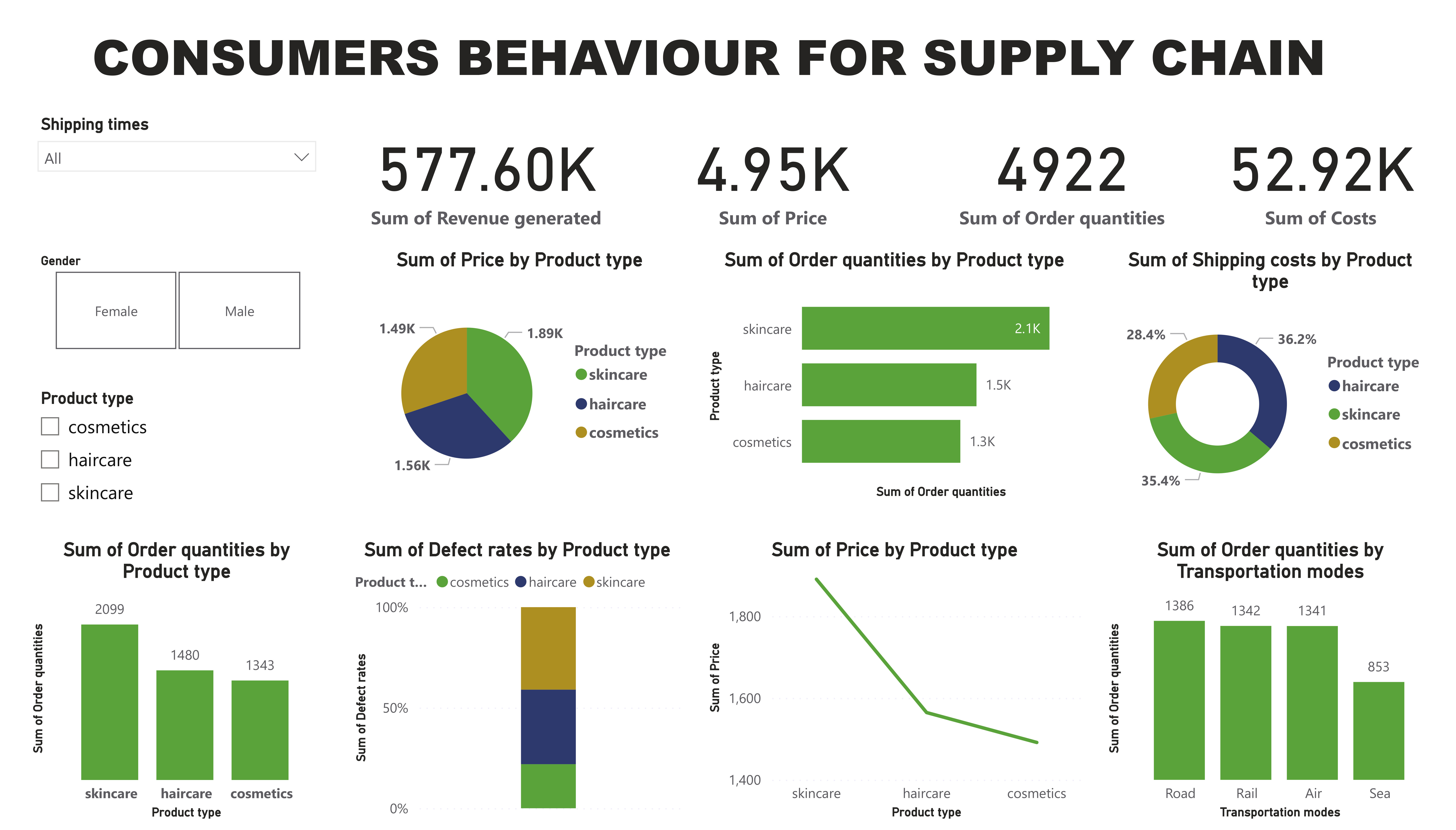
This consumer behavior dashboard unveils interesting trends in supply chain preferences. Females tend to experience longer shipping times compared to males. Additionally, females typically place smaller orders, particularly in skincare and cosmetics, which reign supreme as the most popular product categories. This data offers valuable insights for businesses. Optimizing delivery times specifically for female customers could improve their experience. Furthermore, understanding gender-based buying behaviors can inform targeted product recommendations and marketing strategies.
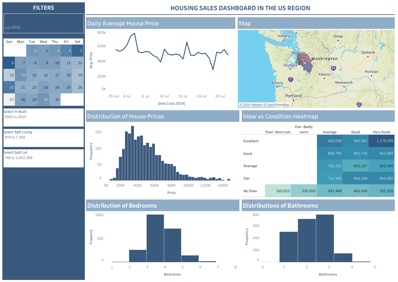
This housing market dashboard zooms in on a specific U.S. region, likely in July 2014. The map paints a clear picture, with average house prices hovering around $400,000 in cities like Olympia, Washington. Prices seem to fluctuate throughout the month, as reflected on the calendar. The graph on the right dives deeper, revealing that most houses fall within the $200,000 to $600,000 range. This dashboard offers a valuable snapshot for potential homebuyers and investors, allowing them to compare prices across cities and understand the general market trends within the region.
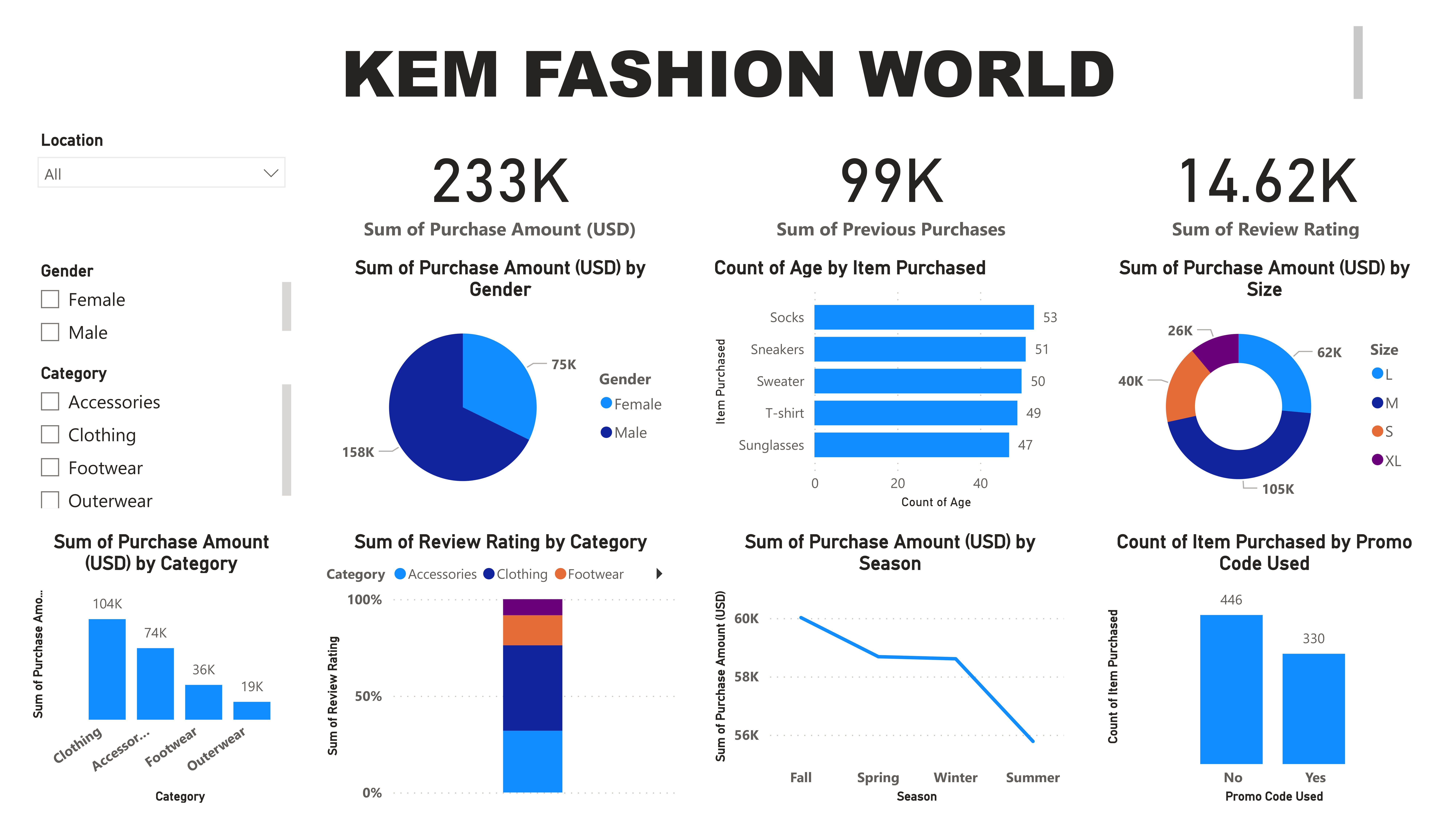
This fashion e-commerce dashboard condenses 26 months of data into a neat summary. Clothing reigns supreme, followed by Footwear, Accessories, and Outerwear. Sales fluctuate with peaks and dips, potentially reflecting seasonal trends like summer and winter highs. Interestingly, the dashboard also reveals sales figures for both male and female customers. This data provides a springboard for understanding customer preferences, optimizing product offerings across categories, and potentially tailoring marketing strategies based on gender and seasonal trends.